
Project Overview
My stakeholders
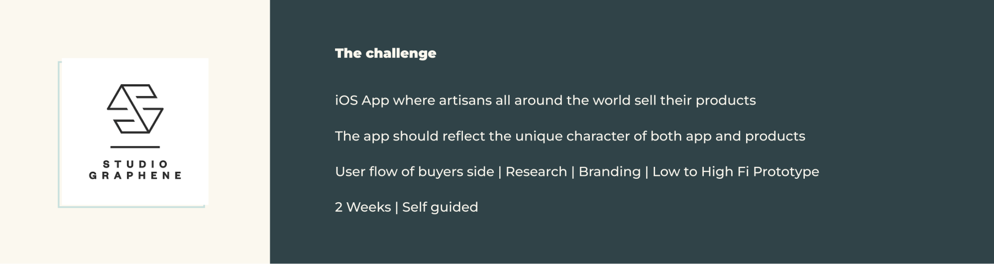
Studio Graphene is a creative agency that designs and builds digital products. They are a team of strategists, designers, engineers and product managers located in London with partner studios in Delhi, Lisbon and Geneva.
Also we have Alice, who a London based artisan, who wants to find a better way showing her handmade products online. We came together in a kick off meeting to discuss next steps.
Research
Surveys
The first step of this process was to understand e-commerce needs of both buyers and sellers. I sent out a survey with 9 questions, regarding shopping habits on already existing crafting platforms, hesitations and possible suggestions of improvement. This resulted in 25 answers, where following points stood out the most.
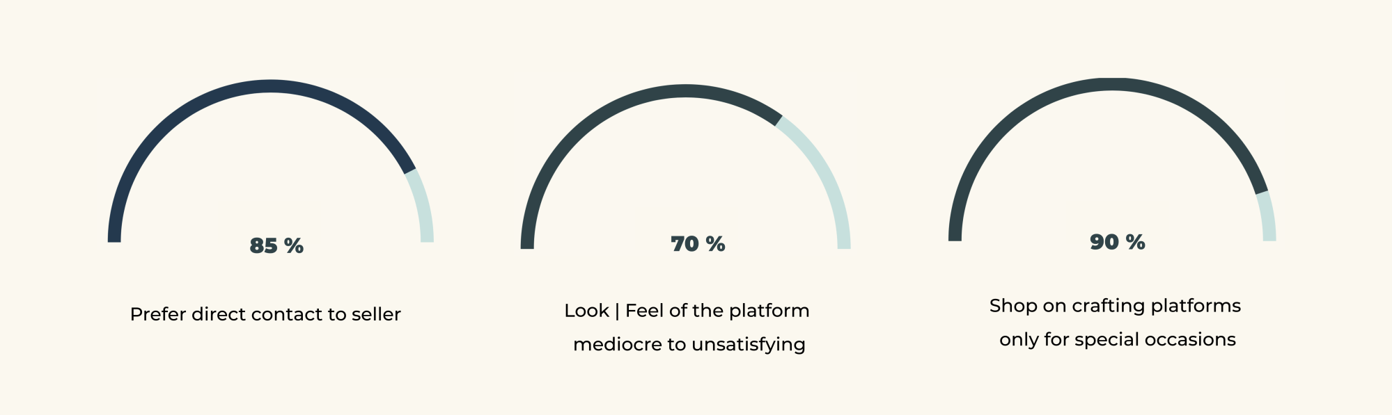
There was also a pattern in other things, like bad experience with or a general hard to reach customer service, too much information for a single page, difficulties with the hierarchy of the platforms and the suspicion of actual not-handmade manufacturing.
On the other side is a huge draw towards having the ability to support local makers and or traditional techniques, purchasing unique products no one else has and knowing the person and the story behind each item.
Interviews
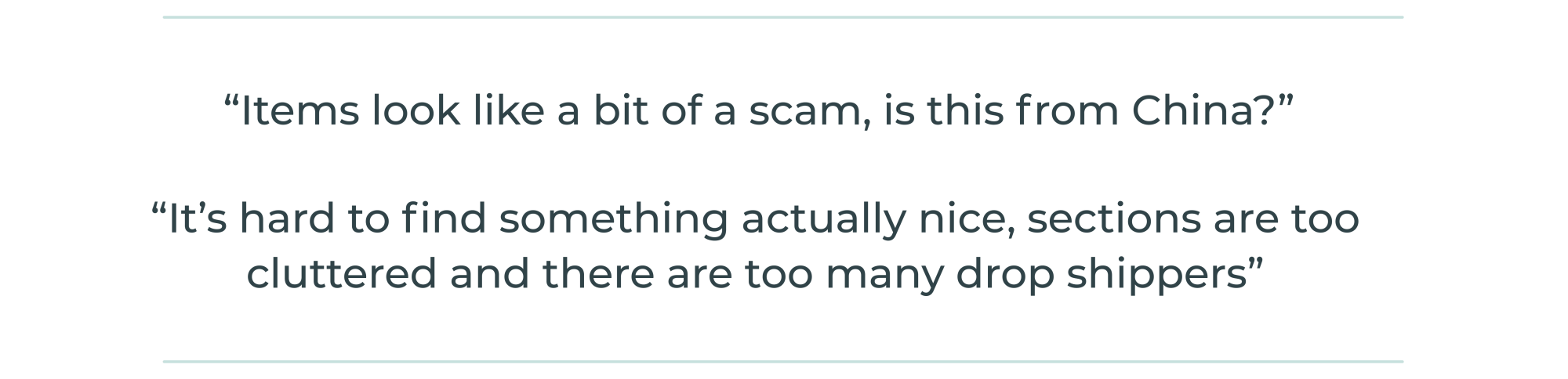
To learn more about possible hesitations and wishes of improvement on the artisans side I conducted interviews with 3 makers. A common ground between them was, although the possibility to sell online is great, there is an overall lack of promotion from the platforms side and it is hard to stand out.

Define & Ideate
Problem Statement
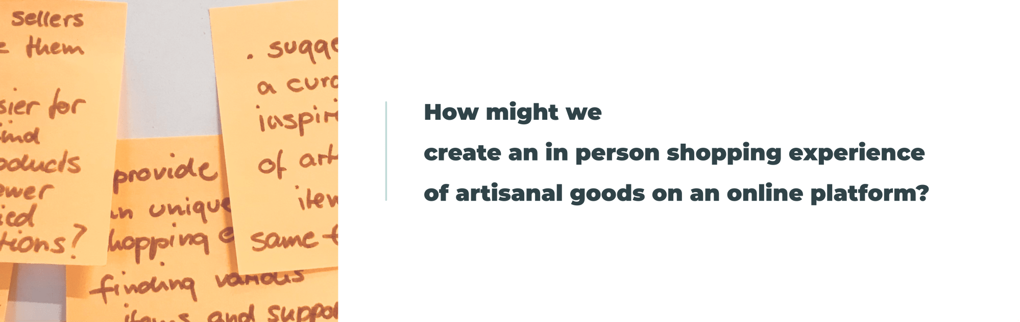
Our users want to have shown a variety of unique handcrafted products and at the same time easy access to problem solving and their purchases, so they have more choice what to pick and at the same time more oversight about what and from who to buy.
So the goal is to create a platform for local sellers to increase their income and popularity and a platform for buyers to find unique, curated items aside from mass markets.
Competitor Analysis
Looking into different platforms helped me to understand their hierarchy of information, their keywords how to look for items, check out process, return policies and if to contact through customer support or to approach the seller directly.

Ideation
Of this research in this stage I started to create a vision of a platform, which should feel almost like being in a little curated corner shop, where browsing through items feels intuitive while you look through different sections, unique products from popular or new makers get suggested to you on the front page, assorted daily by default of the app or by what other people liked or shared.
Also makers can set up an own makers page through a dashboard, which works like a built in shop, where makers can show who is behind the products they sell. In that sense Artisany works like a mediator between buyers and sellers, who handles distribution and customer service himself.
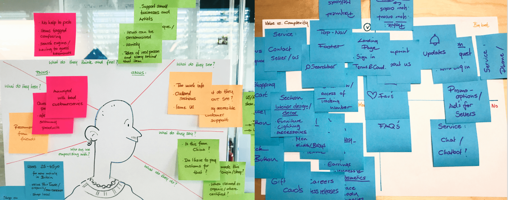
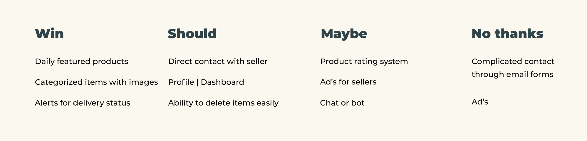
To get a better idea how to structure the hierarchy I organized all information using the Value versus Complexity diagram.
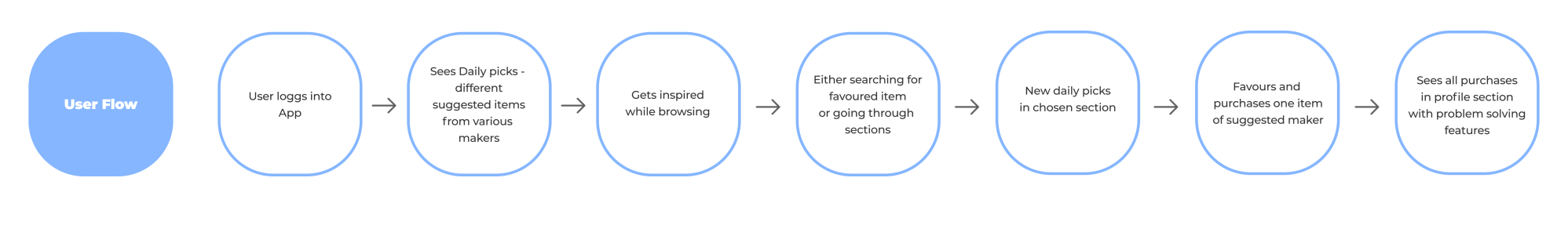
To get a better idea how to structure the hierarchy I organized all information usIn the User Flow I saw the steps the user would take to navigate through the app to perform certain actions. This would be the ideal Happy Path for a user to accomplish the tasks.
Branding
Style Tile & Moods
As Studio Graphene already gave the brand name I created a logo out of font and simple brush swipe to give it a painty, handicrafty vibe. The use of softer base colours for backgrounds gives enough space to let products and makers shine. I chose to go with shades of green as signal colours because they have been proven to make users feel relaxed and safe. I then took that to develop the icon library and different buttons. Artisany’s brand attributes are: Contemporary, decluttered, sophisticated, down to earth.

Prototyping
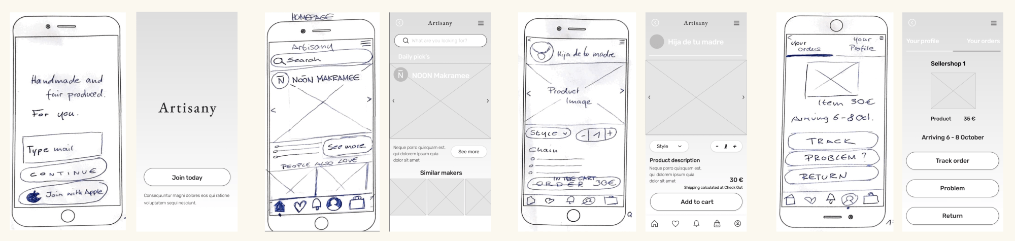
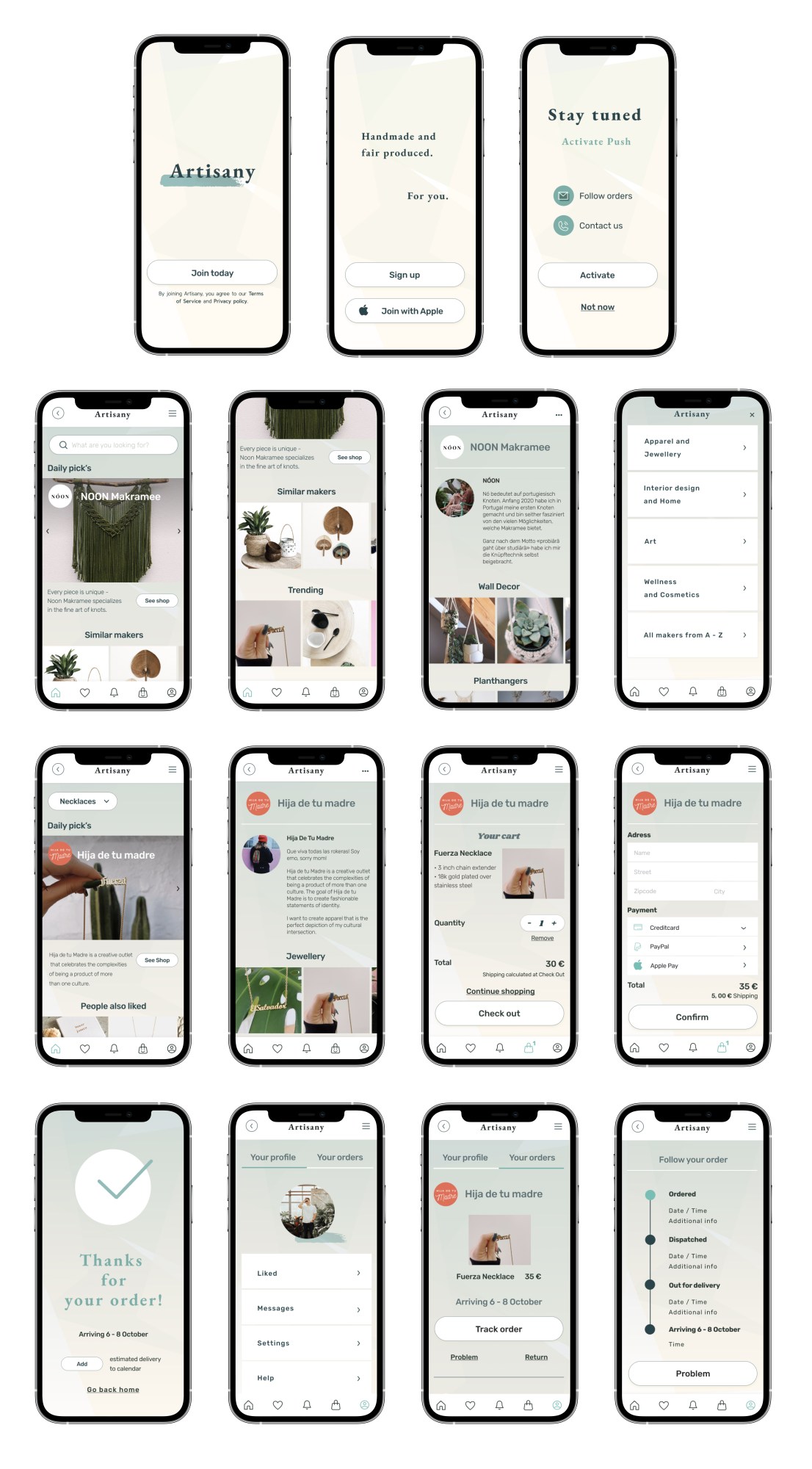
During the Mid Fi stage I made several adjustments to solve issues that appeared during testing the Lo Fi with 4 people. For example, the initial idea to get intrigued by Daily pick’s, didn’t make clear if users click on either just the item or the shop of the seller. So in the final version you first visit the presented shop, where you can browse for their presented item.
Final Prototype
High Fidelity
For finally creating the MVO I took colors, fonts, and look and feel and combined it. I wanted to continue the simple and straightforward design. Originally, I designed the screens in dark mode but after testing the first result with 5 people they were not pleased with the visual elements so I decided to adjust things to a light and soft screen design.
All rights reserved © 2024 by Laura Josephine Oechel
