The problem statement
My creative-agency Neuwaerts opened 2015 the „Transformationwerk“,
an event- and workshop-location in the middle of Hannover, Germany.
Beginning of 2022, as I started working for Neuwaerts as a creative for screen design and marketing content, I soon got briefed to give their Transformationswerk a fresh overhaul; complete with a new logo, style guide and website structure.
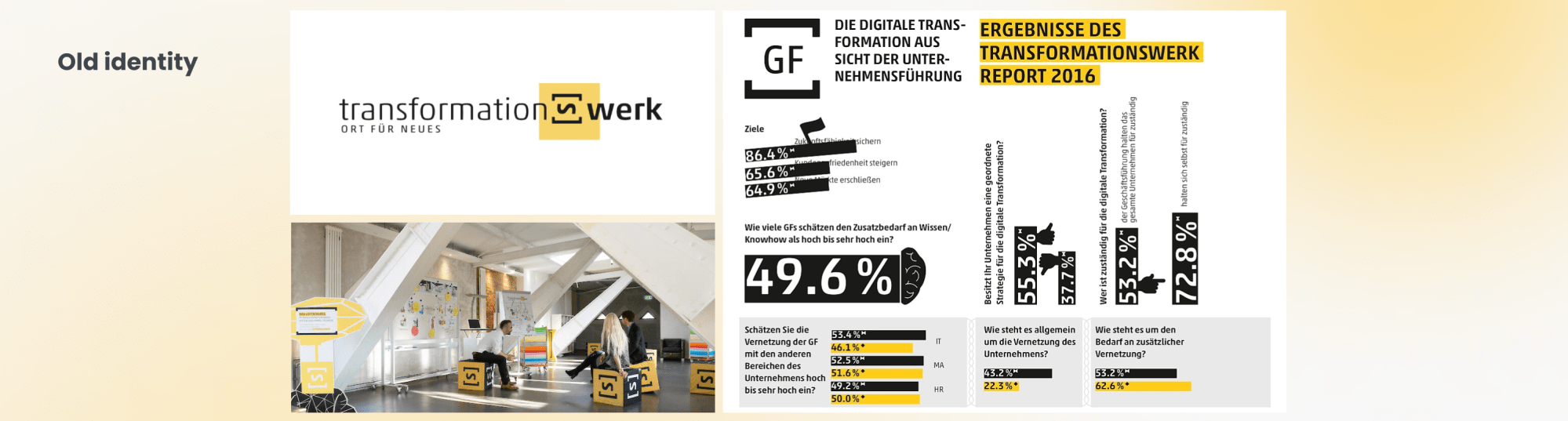
The old identity did not feel current, info graphics were cluttered and made of harsh contrasts, that weakened readability. The web-presence contained an unclear navigation, pictures were small and didn’t offer a lasting impression.
Logo development
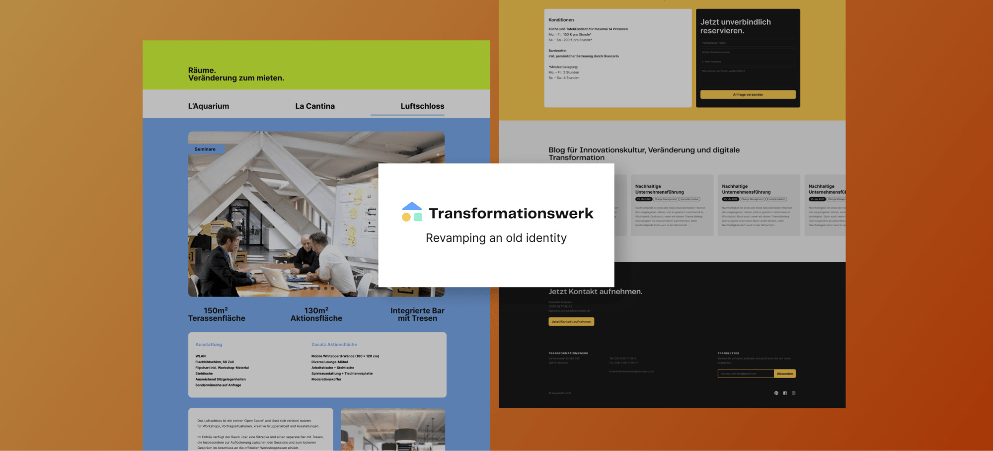
Transformationswerk consists of 3 inspiring rooms, that can be individually customized; the first is the event-kitchen LaCantina, because the best talks take place in the kitchen. The second is LaQuarium, a colorful „glass-square“ for workshops and presentations. The third is Luftschloss, a triangular
open-space on the top of the building for visionary talks or exhibitions.
For the logo I wanted to encapsulate the special shape of these rooms, to provide a quick recognition value and set a color mood for each room.
LaCantina I saw as a warm yellow circle, a cozy-lit kitchen for memorable talks, LaQuarium as a squared think-tank in a fresh aqua tone and Luftschloss as a triangle-shape in an airy blue tone, that sits on the top of the two others.
Style guide
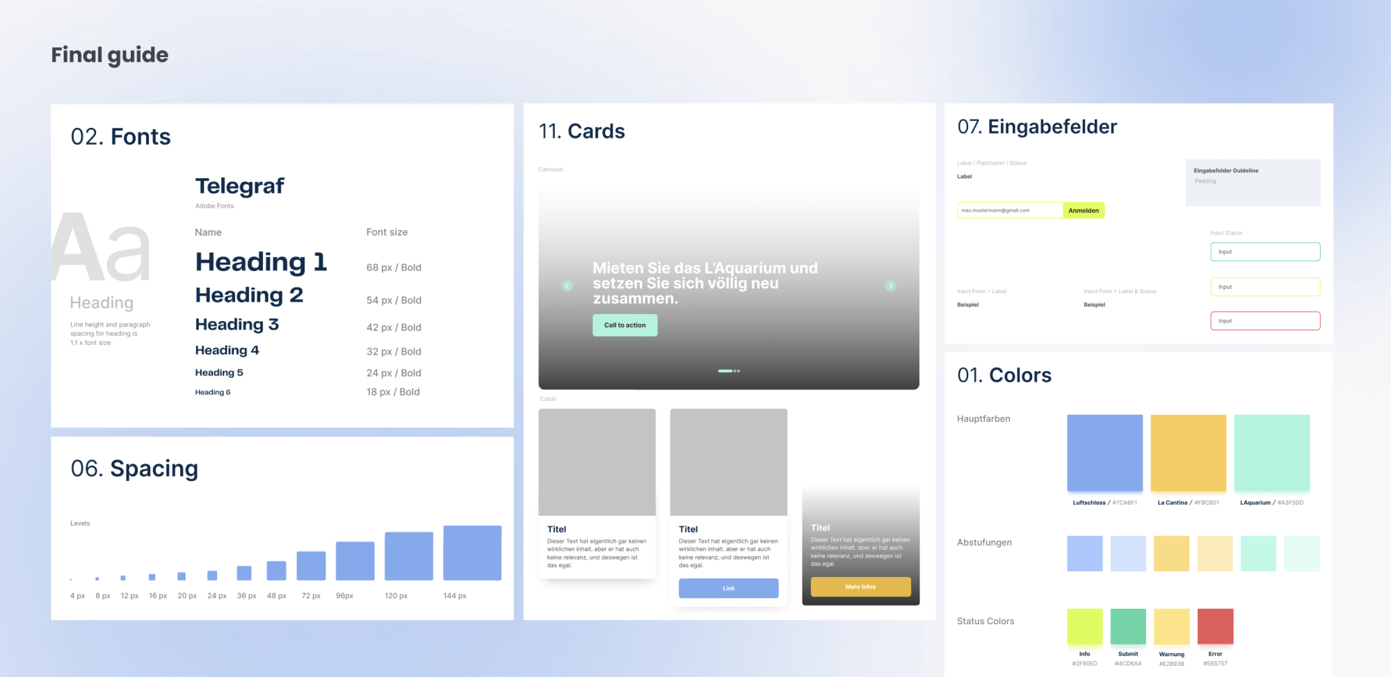
With the new style guide I wanna cover necessary guidelines for the new interfaces, starting with the brand-voice up to the UI elements.
It contains 10 positions; colours, fonts, logo, icons, grid system, spacing, input fields, CTAs, elements (bullets, banner, caroussel) and cards.
All building blocks, or as I like to call them; atoms, are layouted as components in Figma, for quick prototyping use.
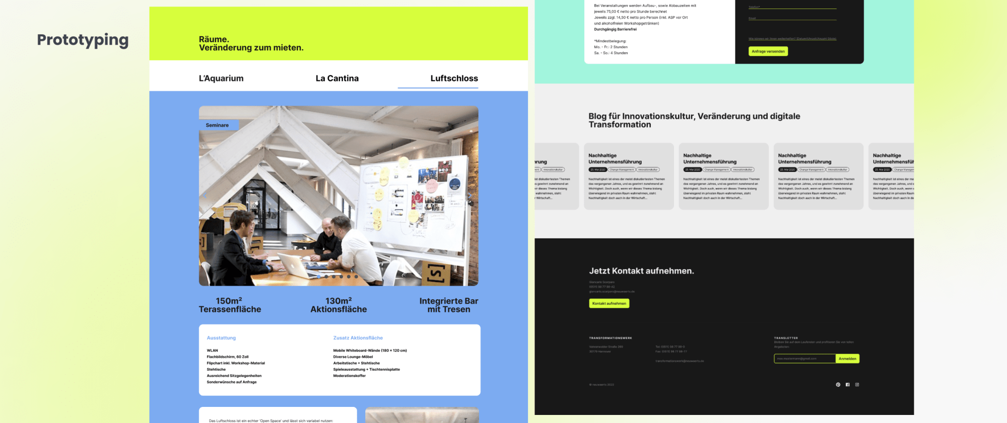
The lionsshare: website prototyping
Our frontend designer and me decided to opt for a straight-forward structure of one scrollable main content, intersected with vertical carousels
to showcase the rooms.
To provide a clear navigation, the 4 main categories; about, rooms, activities and contact information are to be found as jump links in the top navigation. Tabs in the room-section show us deeper information about each room,
as well as engaging images.
Coding and CSS styling of the prototype was taken over by our frontend designer.
Final result & learnings
I’m happy and proud to have guided this project through the very start phase; developing a new brand identity, until the prototyping process.
It engaged me in my strengths; giving a brand a voice through colors,
logo design and setting up the landing page design, as well as deepen my learnings about implementing a no-nonsense UX.
Easy scrolling patterns let you adjust the pace, delivery, and interactivity of the content. Considering that our attention span on the web has dropped to about 8 seconds, a creative scrolling experience can prolong user interest.
Seamless teamwork with my creative director and our frontend designer made one of my first projects at Neuwaerts reality:
